
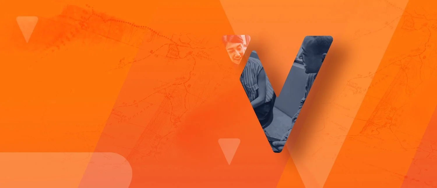
Verve UX Design

Working within the constraints of a limited budget, we looked for ways to maximize efficiency and provide the most value for Verve Coaching. The client had some experience with Squarespace so rather than designing a site from scratch, we focused on UX strategy and brand development. Our goals were to help Verve reach a wider audience and to refine the brand so that it better reflected Verve’s friendly yet professional approach. This has been one of my favorite projects to work on because it heavily focused on UX strategy.
RoleUX Design
Information Architecture
Logo
Branding

UX Design
Personas
Based on our conversations with Erek, we defined three key personas:
HR Directors
Entrepreneurs
The greater coaching community
We broke entrepreneurs and the coaching community into smaller subgroups, and identified the goals and pages of interest for each, in order to inform how we structured the sitemap and our content recommendations.

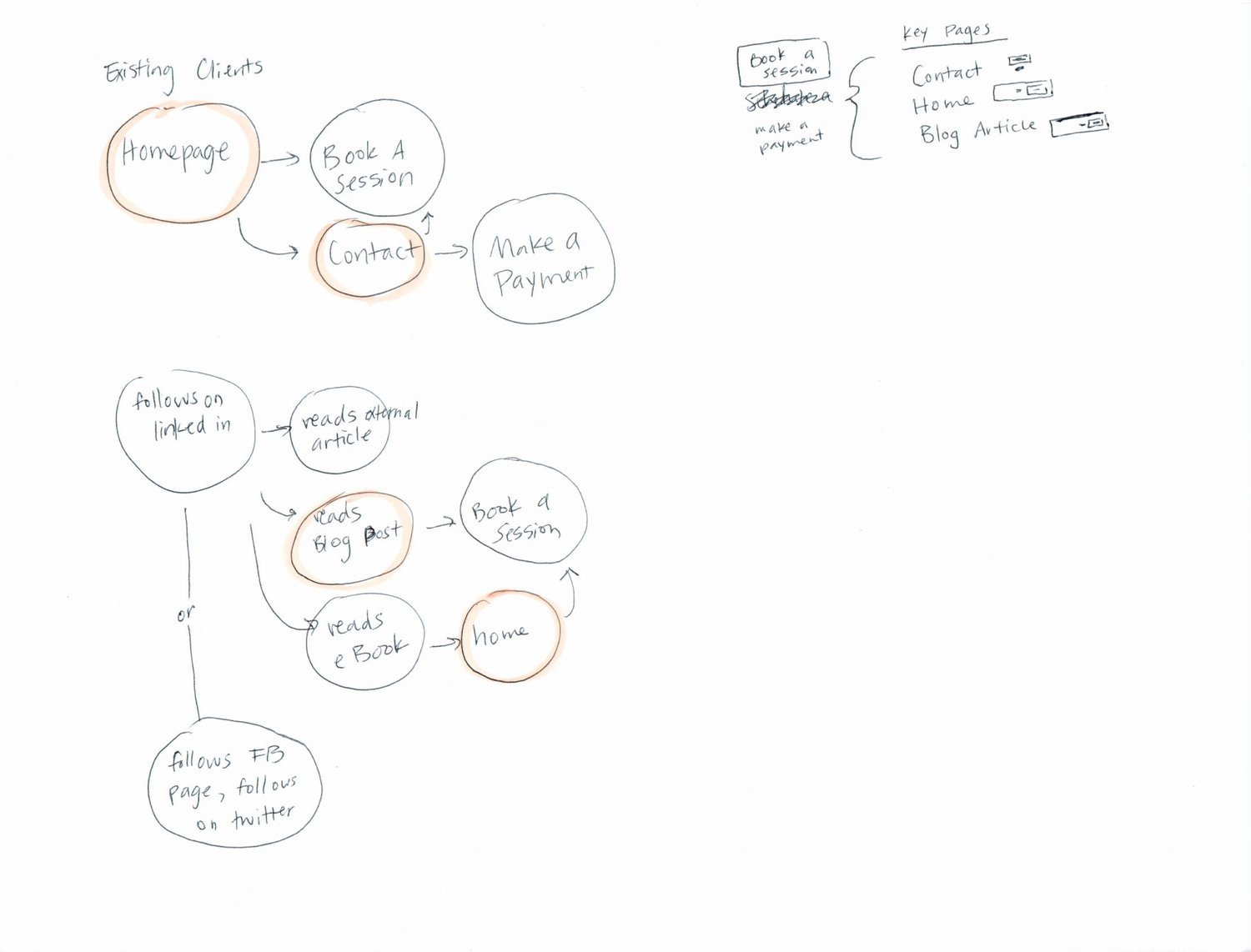
Flows
Based on the limited analytics data available through Squarespace, we were able to glean that Erek’s bio was the most popular page besides the homepage. With this in mind, we mapped out how we assumed users would navigate the site, in order to better strategize about how to organize pages, what content to include on each page, and where to place calls-to-action.


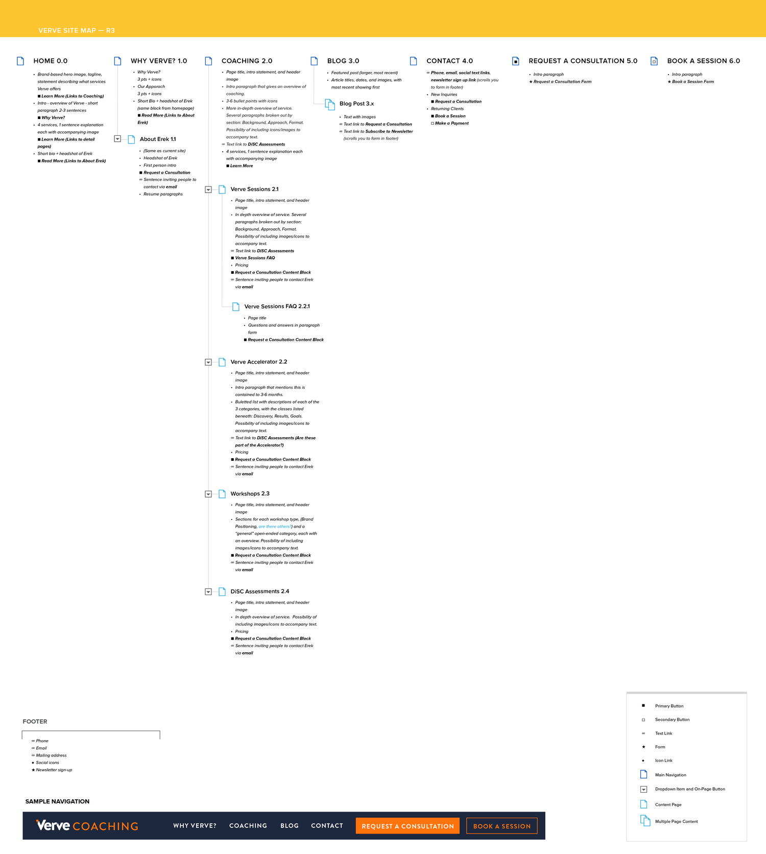
Sitemap
The original site relied on on-page buttons to direct users through the site. We noticed people were not clicking through to these in-depth pages, so we made the recommendation of bringing these pages into the dropdown navigation for easier access. We also recommended creating a page for each service within coaching, so that potential clients could better understand Verve’s offerings. Since Erek was looking to increase the number of qualified leads, we recommended including pricing on those pages, so that customers could self-select before reaching out. Based on the personas and flows, we recommended including calls to request a consultation on key conversion pages, such as Erek’s bio, blog posts, and service detail pages (such as Verve Sessions, Verve Accelerator, etc.).
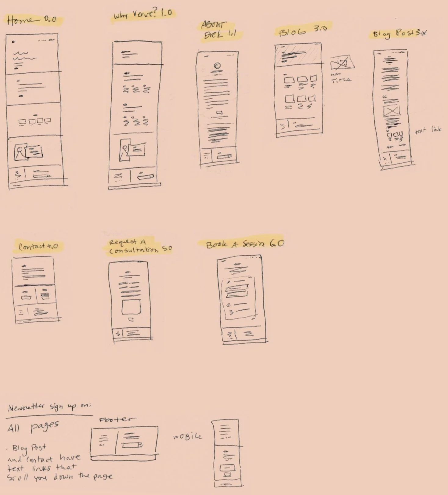
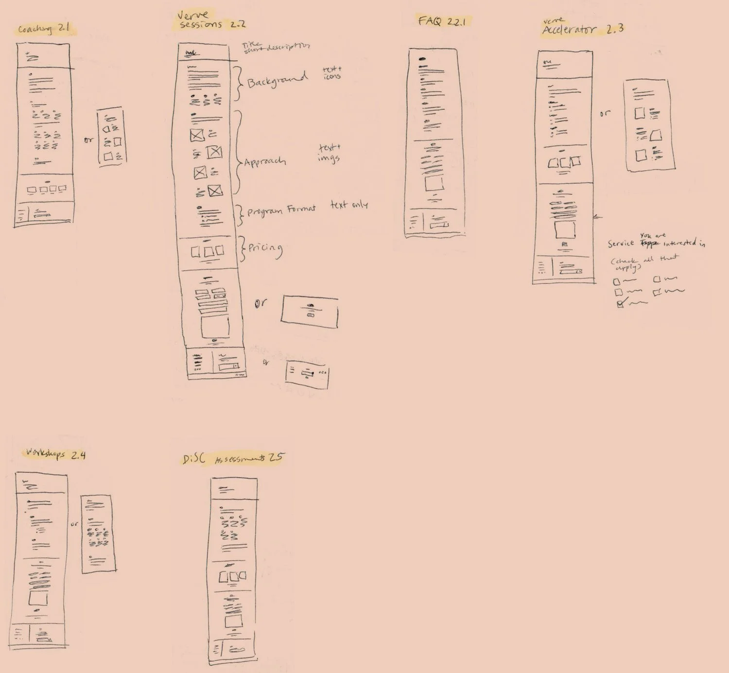
Wireframes
We created wireframes to help illustrate the vision we laid out in the sitemap. Since the content for the service pages had not been finalized at this point, we included a few layout options for those pages to give Verve some flexibility.
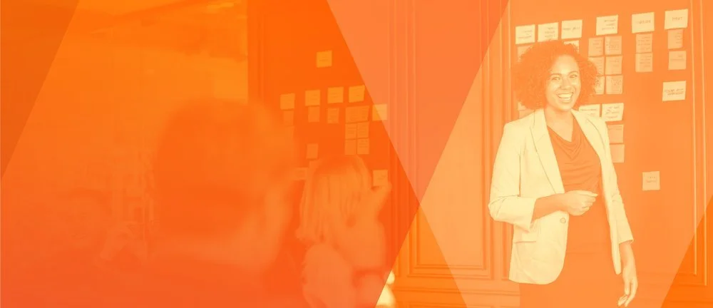
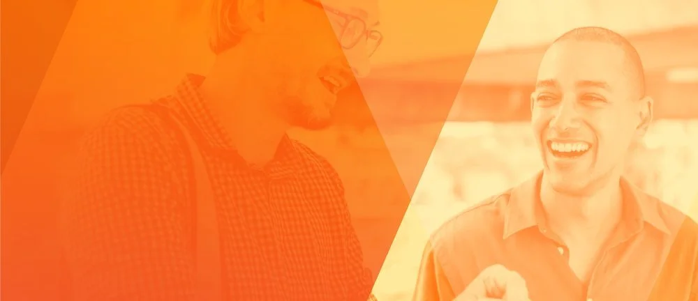
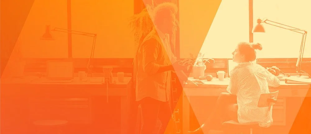
Brand Identity
Verve is an approachable, friendly brand that nonetheless feels strong, confident, and bold. The brand is built on natural, warm photography that emphasizes human connection, intimacy and authenticity and imagery that subtly denotes navigating, collaborating, and embarking on a journey together. Below are the assets we created for use on the new website.
Hero Image

On-Page Image Treatments

2.1 Verve Sessions

2.2 Verve Accelerator

2.3 Workshops

2.4 DiSC Assessments
Landing Page Headers
1.0 Why Verve Header

2.0 Coaching Header

2.1 Verve Sessions Header
2.3 Workshops Header
2.2 Verve Accelerator Header
2.4 DiSC Assessments Header
Icons

A trusted thought partner

Save time and money

Take action to achieve your goals

Bring out the best in others
Patterns

Default Header Image

Background Pattern
Brand
Logo

Business Cards
Social

Header Image
Profile Image