ArborBridge Website
When redesigning ArborBridge’s website, our goal was to make their brand feel more modern and welcoming. By blending hand-drawn elements with sleek geometric patterns, we crafted an aesthetic that was both approachable and polished. This redesign resonated with our client, leading them to keep us on retainer for continued design and marketing services.
RoleUI Design
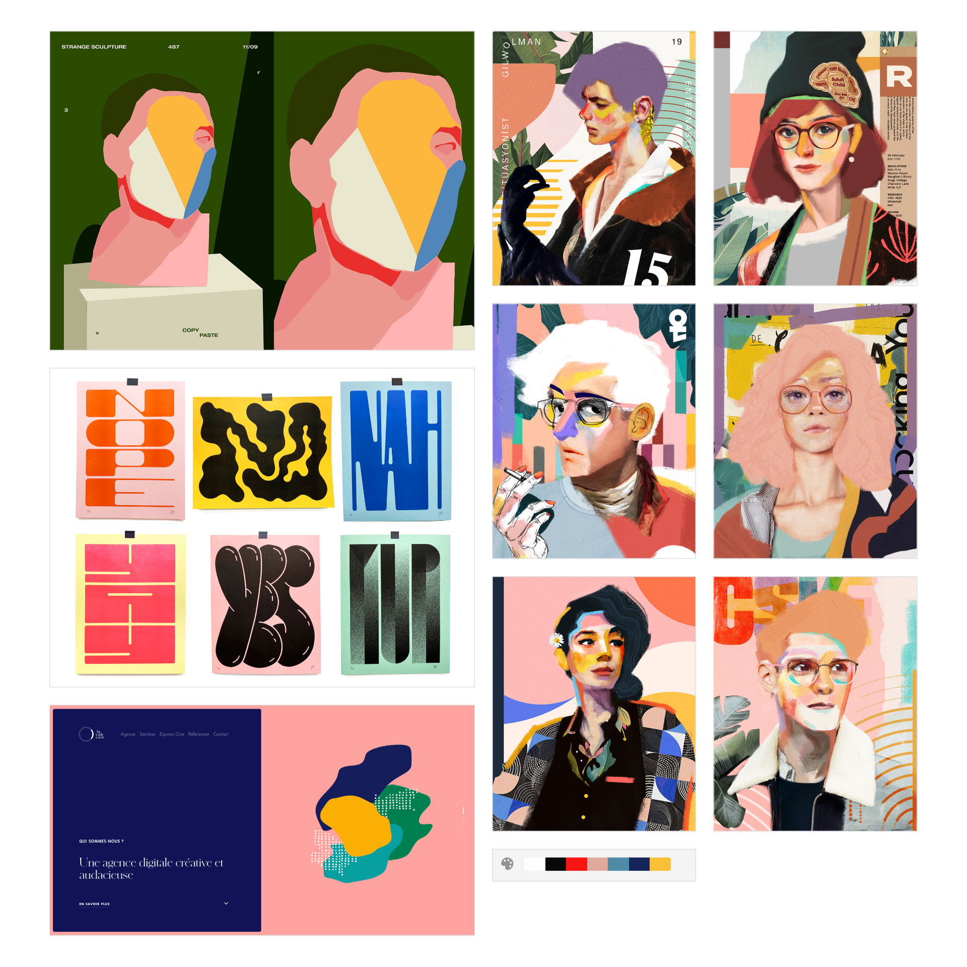
Mood Boards
Based on their answers to our brand survey, especially regarding their target audience (parents and students) and their desired brand traits (modern, welcoming, polished), I put together two options for how their new brand could look and feel.
Style Tiles
Round 1
The client wanted to blend elements of both the “Fun, Colorful, Organic” and the “Clean, Minimal, Geometric” mood boards, so I explored both in the style tiles.
Final Style Tiles
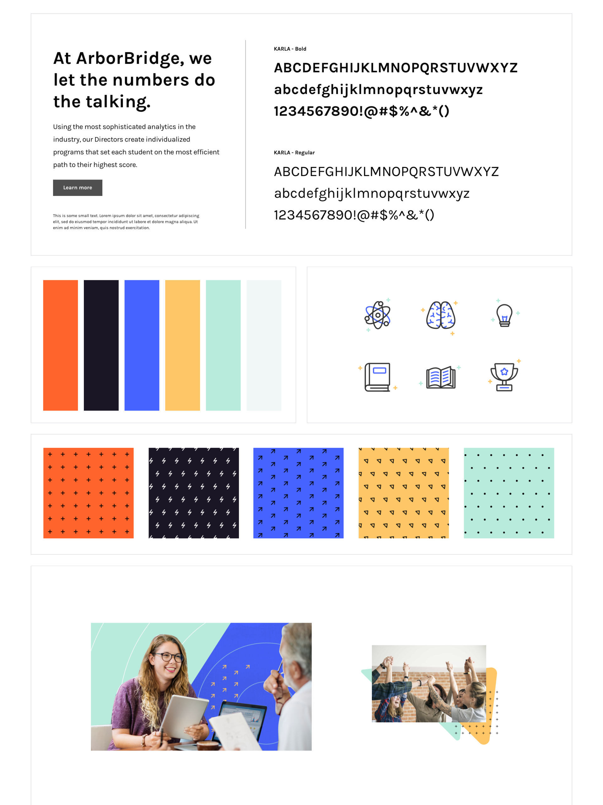
FontsThe client selected this font pairing of a modern serif and a clean sans. The serif feels academic and elegant but not stuffy, while the designed-for web sans creates an easy, inviting reading experience. The balance of the two strikes a balance between approachable and polished — the sweet spot our client was aiming for as part of it’s brand refresh.
Colors & IconsThe color palette was a sophisticated take on a primary color scheme. Primary colors are often associated with education and children, so we thought giving these colors a modern twist would work well for our client, an online tutoring brand that targets middle and high school students. To symbolize growth, we introduced mint green into the palette. The complete color scheme consisted of smoky pastels with strong pops of color for imagery and areas of emphasis, balanced by light neutral tones for backgrounds.
The selected icons subtly integrate color with a clean, monoline-style, creating a modern and inviting aesthetic.
PatternsThe plus sign and arrow symbols in these patterns represent growth and improvement. The lightning bolts represent the efficiency of the program.
Image TreatmentsThe bright bursts of color paired with plenty of whitespace creates a clean and professional look while offsetting it with some fun elements, such as colorful patterns and upward-pointing arrows. The collage and layering effect also supports the idea that students are multilayered, multi-talented, and dynamic.
Wireframes
At the wireframe stage, I worked out the text hierarchy and general layout. For the scope of this project, we created desktop and mobile wireframes for just two core pages (the homepage and “Our Services” page), and then moved straight into UI mockups for the sake of efficiency.
Final UI Mockups
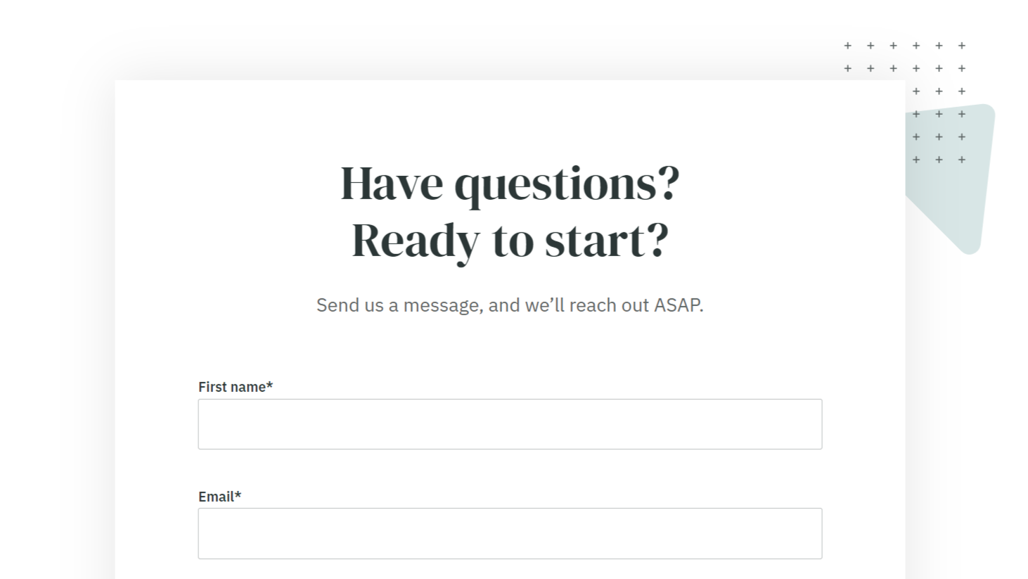
UI DetailsAs the lead designer on the project, I designed most of the website, including the homepage, the services page, the about page, the resource library, the blog post template, the pricing page, and most of the individual service pages, including the SAT and ISEE pages. A very talented developer made my designs a reality. I was very grateful to work with such a talented team!


