
Rio Website

I absolutely loved working on this project. I had an incredible team of developers and designers, and I adored the client — they were so appreciative and affirming. I also loved that they were doing good work in the world — helping businesses comply with sustainability standards.
RoleUI Design
Branding
Animation Direction
Custom Icons

Mood Boards
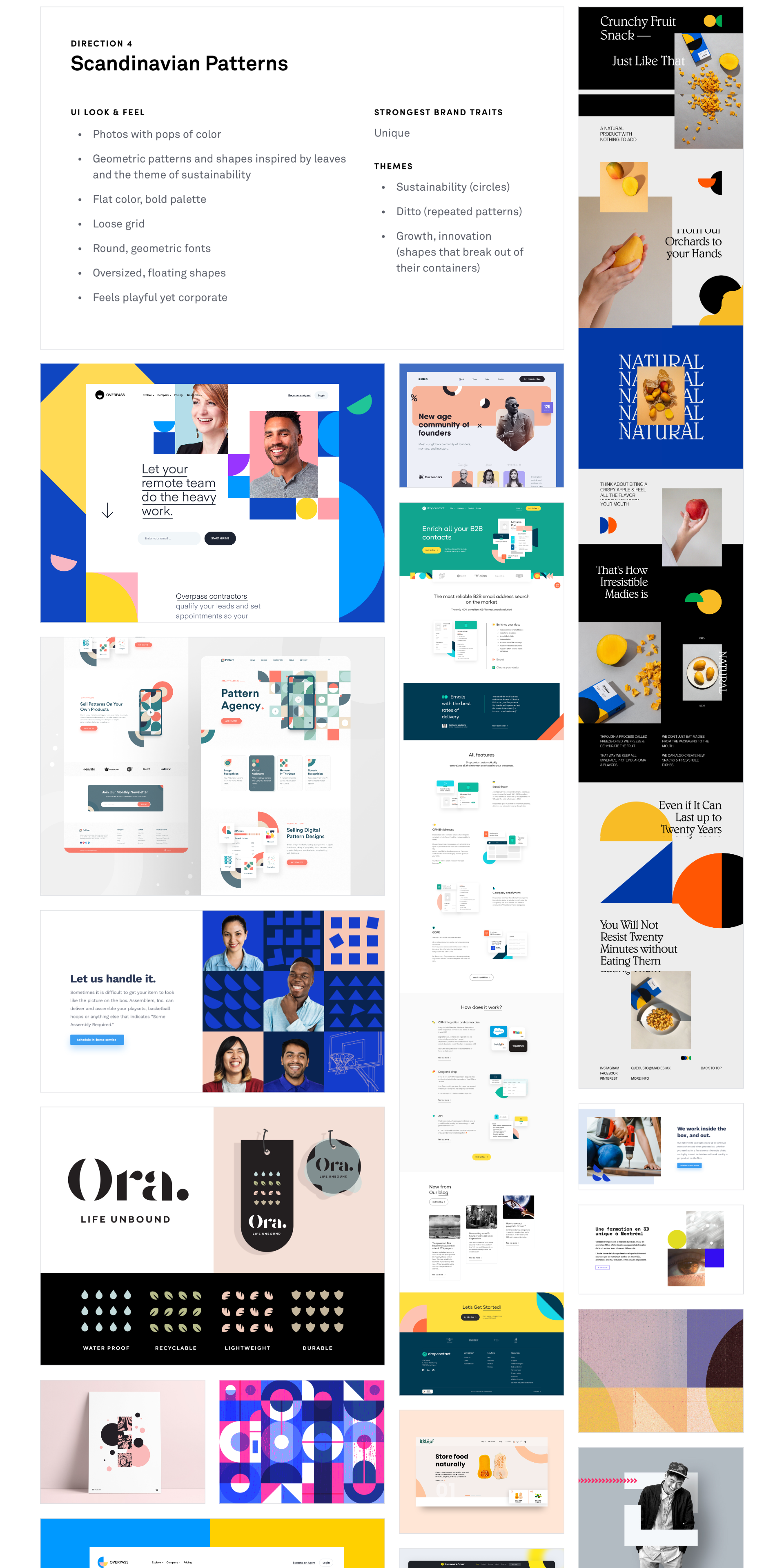
I reviewed the brand survey and collected all the adjectives the client used to describe brand. Those adjectives were: trustworthy, intelligent, precise, minimal, unique, attractive, inspiring, and empowering. I then proposed four different approaches that embodied those traits.
-
![]()
Organic Plant Shapes
Strongest brand traits: Unique, Attractive
-
![]()
Fresh Minimalism
Strongest brand traits: Minimal, Trustworthy, Intelligent, Precise
-
![]()
Futuristic Minimalism
Strongest brand traits: Minimal, Trustworthy, Intelligent, Precise, Inspiring, Empowering, Attractive
-
![]()
Scandinavian Patterns
Strongest brand trait: Unique


Style Tiles
Round 1
The client liked both the “Organic Plant Shapes” and the “Futuristic Minimalism” mood boards, so I explored both options in the style tiles.


Round 2
The client selected the “Futuristic Minimalism” direction and requested we use the app’s original color palette, so I applied this feedback in the second round.

Development Brief
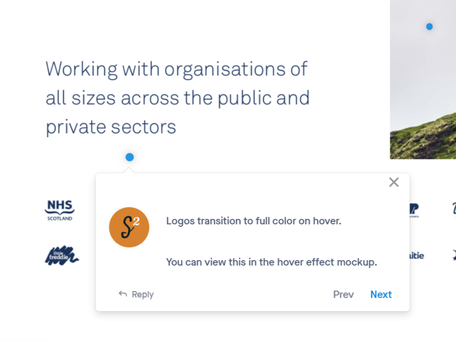
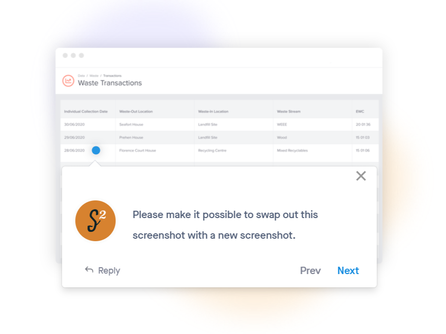
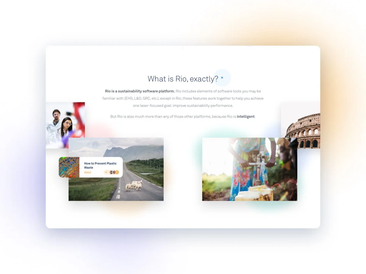
On the final homepage mockup, I added notes to communicate functionality and animation requests that wouldn’t be apparent by looking at a static design.
I was blown away by how the final website turned out—which is a huge credit to the amazing developers on our team.


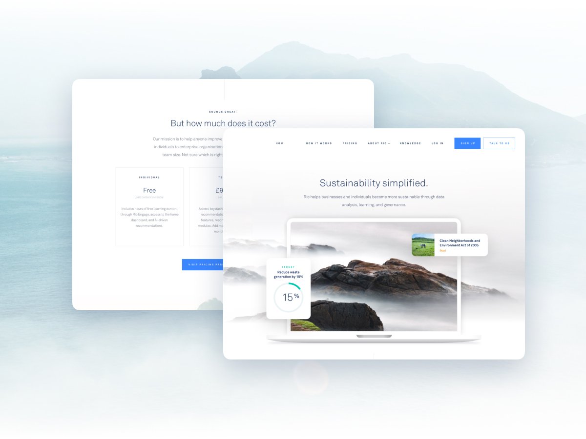
Final UI Mockups


Custom icons

As the lead designer on this project, I designed the core pages (the homepage and solutions page) before handing off to other members of my team. I got feedback from my colleagues that they enjoyed working on this brand.
The client loved the design, and they even shared that they gained investor interest just by showing them the mockups. (This made me really happy to hear!) I was proud of how the website came out and they loved it too, enough to keep us on retainer for additional marketing services once the website was completed.